02PRODUCT DESIGN
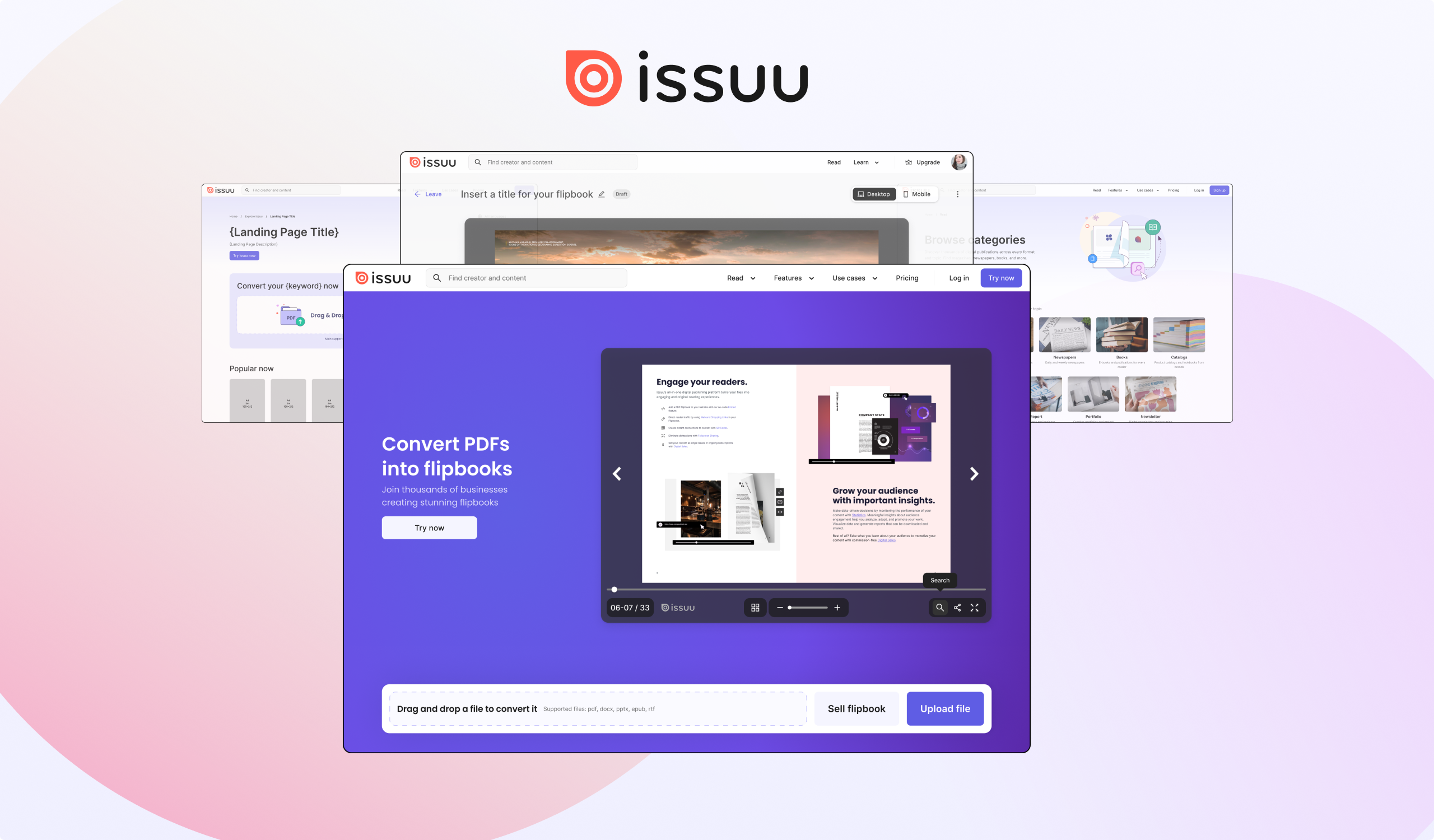
Issuu is a digital publishing platform that lets creators upload PDFs and turn them into interactive flipbooks, embedded publications, and shareable content. With a large base of publishers, from indie magazines to brand marketers, the platform sits at the intersection of content discovery and creator tools.
I joined as the solo product designer, focusing on Growth, thus on initiatives to drive acquisition, activation, and long-term retention across the marketing website and the core product.
The first front was the marketing homepage, tested through a 2×2 a/b test: social proof presence vs. absence, and signup prominence vs. demo/upload flow prominence. The hypothesis was that making the core action more visible would improve top-of-funnel conversion, and the data confirmed it. Signup-first treatments drove higher ARPU and better LTV; social proof, on the other hand, showed no statistically significant difference, so the leaner variant, no social proof, was kept, avoiding the operational overhead of sourcing publisher content.
In parallel, I redesigned the categories and publication-type pages to improve organic discoverability. Content clustering was derived from cluster analysis, organising reads by type (magazines, brochures, catalogs, etc.) and topic. I also designed an Airslate-style template to be dynamically populated at scale, creating thousands of SEO long-tail pages targeting specific search intents, a longer-term bet whose results are still being assessed.
The most critical initiative, and the one I elevated from a brief redesign task to a strategic product experiment. Publishing is the platform's core activation moment: no uploads means no content, no content means no readers.
A behavioral analysis of the existing flow revealed a sharp mismatch: most metadata options (aesthetics edits, privacy settings, links, share settings) were visible and reachable, yet barely touched, and consistently added on a second moment, more than 7 days after publication. This was the insight that reframed the effort.
I proposed a 3-segment experiment, all sharing a new information architecture, with the goal of surfacing a faster, lower-friction activation path:
Across these initiatives, the work consistently followed a data-in, data-out approach: behavioral analysis informed the design decisions, and a/b testing validated them at scale. The homepage experiment produced a clear winner with measurable monetization gains. The publishing flow experiment is running, designed to surface not just a better UI but a leaner activation path. The SEO play is a long-term investment, with discoverability impact expected to compound over time.